Gwent: The Witcher Card Game, was ported to iOS and Android in 2019 and 2020 respectively, with vast changes made to the user interface to accomodate touch input.
As a Free-to-Play game, every area of friction that a player could run in to could translate to players dropping out, leading to lowered player retention.
As a Free-to-Play game, every area of friction that a player could run in to could translate to players dropping out, leading to lowered player retention.
The Play Menu in particular, while functional on mobile with touch, was still designed with mouse input in mind, i.e. relying on mouse hover. Besides that, Gwent as a game evolved in complexity since it was officially released, leading new mobile players to be confused when confronted with a screen that didn't do enough to explain itself after they finished the tutorial.

The Play Menu before the redesign on PC and iPhone 11 Pro Max
My squad within the Gwent development team was charged with improving the player experience of playing the game and interacting with all its features. Up until this point, I had worked on only a handful of smaller design tasks while simultaneously working as a UI QA.
So when the opportunity arose to work on this project, I was very excited to take on something significantly larger in scope, as these were improvements I was already passionately advocating for.

Requirements of the Redesign
- One design must work on all platforms and all screen sizes. No bespoke variants for any given platform.
- Game mode descriptions must be immediately visible, with no reliance on mouse hover.
- Changing game modes and their related settings should be easily done with a single click or tap.
- Information relating to the current season or season transition must be clearly shown.
- If a game mode is locked, the reason must be clearly communicated.

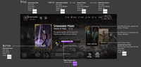
Standard Mode
We wanted to more prominently display the player's progression in their current Rank, inform the player what season they are, for how long in and/or if there is a season transition, and make toggling the "Ranked Progression" setting easier with touch.


"Pro Rank" variant of the Standard Mode card
Through talking with some of the competative Gwent players and learning what they would want to see in a redesign, I advocated for adding a special "Pro Rank" version of the Standard Mode menu if the player is in the highest rank possible in a given season, extra information is surfaced directly on the menu depending on the faction of the deck selected, saving the player time going into their profile to find the stats themselves.
Seasonal Mode
On PC and console, we relied on the player using hover to show the Seasonal game mode rules in a tooltip.
With the transition to mobile, we needed to show this important information without using hover.
The description also had to support scrolling as the game mode rules previously could be too large to comfortably fit on the screen.
The description also had to support scrolling as the game mode rules previously could be too large to comfortably fit on the screen.


Seasonal Mode level locked
The Seasonal Mode would only be available after the player gained a suitable level of experience. For new players, we needed to clearly communicate why they can't start matchmaking until they reached Level 10.
I decided on an eye-catching, unique modal message, removing the 'Play' call-to-action, greying out the card and description, and triggering a "locked" SFX should the player still attempt to press on the card.
I decided on an eye-catching, unique modal message, removing the 'Play' call-to-action, greying out the card and description, and triggering a "locked" SFX should the player still attempt to press on the card.
Training Mode
During the design and development process, the idea of moving "Ranked Progression" being turned off into the Training Mode card's section and instead name categorise it as 'training' was debated. Ultimately, the decision was made not to move the toggle from Standard Mode for the initial redesign release, and return to the matter later.


A screenshot from the latest version of the game.
A "Draft" mode card was added to the Play Menu in a later update.
A "Draft" mode card was added to the Play Menu in a later update.
Video of the redesigned Play Menu in the Main Menu
Supplementary Mockups


Top Left: Matchmaking waiting screen with spinning card, Top Right: Standard Mode on iPad, Bottom: First step of Standard Mode tutorial matches
Product Owner: Krzysztof Sobczak
UI Design Lead: Horatiu Sasu
UI Design Lead: Horatiu Sasu
Game Director: Jason Slama
Illustration credits
Standard Mode: "Geralt: Yrden", Anna Podedworna
Seasonal Mode: "Kingslayer", Nemanja Stankovic
Training Mode: "Decoy", Marek Madaj
Cardbacks (thumbnails), Avatars, Frames, Deck Leader Ability Icons: Renata Mrowinska, Angelina Lisouskaya